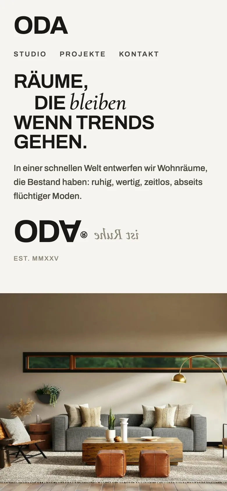
Split screen
Text and interior photograph stand side by side as equals.
An interior studio for rooms that last. Calm, refined and timeless, just like the work.
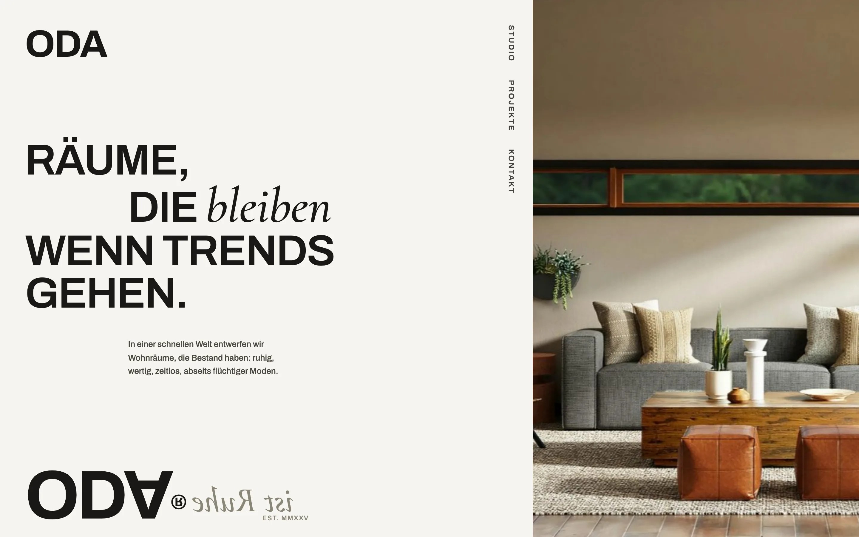
ODA designs living spaces away from passing trends. The website has to make that attitude tangible: warm rather than cold, editorial rather than salesy.
A split surface: paper and typography on the left, a large interior photograph on the right. In the headline a single word switches into a fine serif italic. A huge logo bottom left anchors the page like a mark on a magazine cover.
Text and interior photograph stand side by side as equals.
Remain becomes the calm accent in the headline.
ODA sits large at the bottom like on a cover.
The same presence, rearranged for the thumb. Content stacks, images stay large and the next step is always within reach.